
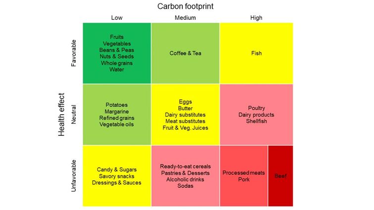
Loma Linda University researchers have developed a chart that simultaneously displays the impact of 30 food groups on both health and the environment. The first of its kind, this visualization shows both types of effects in one clear, simple image that can be understood by consumers, health professionals, policy makers, and food companies and can help promote better decision-making between different food groups.
The chart includes three colors, mimicking the pattern of traffic signal lights—green for beneficial foods, red for foods that can harm health and the environment, and yellow for foods in the middle. Foods known to be positive for both human health and the environment are displayed in the upper-left quadrant of a nine-quadrant chart. Foods known to have greater negative impacts on human health and the environment are displayed in the lower-right quadrant.
The study, based on review of previous studies, was published today in the journal Frontiers in Nutrition.
The foods found to be most beneficial for both humans and the environment are whole plant foods, such as fruits, nuts, seeds, legumes, and whole grains. The foods found to be most detrimental to health and the environment are red meat and, processed meats, with extra emphasis on beef for its exceptionally high carbon footprint.
Impacts on health are gauged based on cardiovascular disease, diabetes, and cancer, some of the most common chronic diseases. Environmental impact is measured in terms of greenhouse gas emissions.
“It’s not enough to base our food choices solely on health benefits—we also need to consider their environmental consequences, which ultimately affect human health as well,” said Joan Sabaté, MD, DrPH professor of Nutrition and Epidemiology at Loma Linda University School of Public Health and the study’s senior investigator. “The visual we developed presents both dimensions in a simple and intuitive way, helping individuals make more informed decisions for the well-being of both people and the planet.”
“The intuitive visualization should help people seeking to make win-win choices by clearly showing which foods have relatively low environmental impacts combined with health promoting benefits,” said Andrew Berardy, PhD the study’s lead author. “It’s a simple representation of a complex topic, but it effectively represents impacts and tradeoffs people often don’t consider when choosing between foods.”
The researchers noted that the matrix wasn’t free of limitations. More nuanced information may not fully be displayed. For example, some nuts require a large amount of water but otherwise have low greenhouse gas emissions. Still, Sabaté said the study offers a starting point for various stakeholders to begin conversations.
More stories about: Research School of Public Health