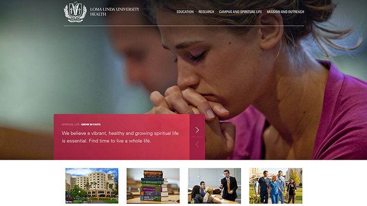
Take a first glimpse of Look 17 at home.llu.edu.
The Loma Linda University website has relaunched, giving a first look at an organization-wide website redesign improving upon form and function. All Loma Linda University Health webpages will receive the same treatment by year’s end, hence the redesign’s moniker: “Look 17.”
The visual experience at llu.edu offers new eye-appeal that, through deliberate use of color, imagery, text and video in a modular layout, guides readers to the content they most want. This experience also translates to mobile viewing.
All this works together with curated content that highlights the integration of health, science and Christian faith that is the hallmark of a Loma Linda University education. Along with better presentation of key information, the homepage now highlights student testimonials and storytelling.
“Sharing your story invites others into your life,” said Ralph Ambrose, director of web services. “Stories build community, inspire hope, teach, even heal. Look 17 empowers storytellers to convey our unique narratives.”
In addition to this improved on-page experience, a new top navigation and a new page footer will ensure easy linkage to the most essential and frequently visited webpages, making it easier for website visitors to find the information they need.
The Web team will relaunch a few more sites, and occasionally an additional feature, every couple of weeks. With these improvements in place, website users will find it easier to locate the information that is vital to their health and education.
